来源地址:http://blog.csdn.net/lincyang/article/details/7421734
组合控件是自定义控件的一种,只不过它是由其他几个原生控件组合而成,故名组合控件。
在实际项目中,GUI会遇到一些可以提取出来做成自定义控件情况。
一个自定义控件的好处就是把一些需要模块化的UI和逻辑放在一起,做到了高内聚,向其他模块提供接口并很少
依赖外界,这样就是低耦合。一个自定义控件就是一个封闭的王国,这里由你掌控。
上述是我自己的一个体会,想必大家也会常做自定义控件吧,就像逻辑部分的模块化一样。
下面我要做一个例子,请看完成图。
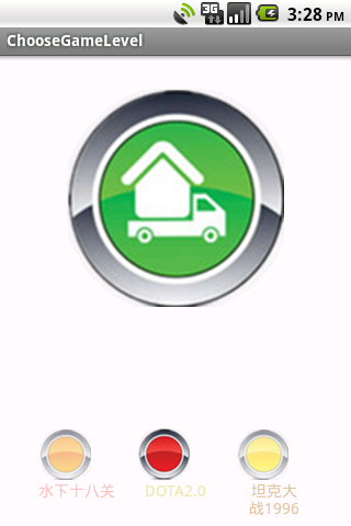
下面一排图片加文字就是组合控件了,我是怎么做的呢?
其实这里用到了两个组合控件,一个是图片+文字,我把它叫一个Item,而三个在一起就是另一个控件了。
重点看这个Item,它有自己的属性如图片、文字、图片大小、文字大小、不透明度等等。这些把它定义在attr文件中,然后在xml文件中
配置,就像我们用原生控件一样。
先看attr文件。
1
2
3
4
5
6
7
8
9
10
11
12
13
| <?xml version="1.0" encoding="utf-8"?>
<resources>
<declare-styleable name="LevelMenuItem">
<attr name="text" format="string" />
<attr name="text_color" format="color"/>
<attr name="text_size" format="dimension" />
<attr name="image_src" format="reference"/>
<attr name="image_bg" format="reference"/>
<attr name="image_alpha" format="integer" />
<attr name="image_height" format="dimension"></attr>
<attr name="image_width" format="dimension" />
</declare-styleable>
</resources>
|
这个文件在values下,和string文件同级。把你自己要定义的属性都写在这里吧。format是属性的“单位”,如果你要问有多少中format呀?答案在这里。
有了属性了,下面看看布局文件level_menu_item.xml。
1
2
3
4
5
6
7
8
9
10
11
12
13
14
15
16
17
18
19
20
| <?xml version="1.0" encoding="utf-8"?>
<LinearLayout xmlns:android="http://schemas.android.com/apk/res/android"
android:layout_width="fill_parent"
android:layout_height="fill_parent"
android:orientation="vertical" >
<ImageView
android:id="@+id/image_item"
android:layout_width="fill_parent"
android:layout_height="fill_parent"
android:scaleType="fitCenter"
/>
<TextView
android:id="@+id/tv_item"
android:layout_width="fill_parent"
android:layout_height="wrap_content"
android:gravity="center_horizontal"
android:textColor="#23ffffff"
android:textSize="25sp"
/>
</LinearLayout>
|
这里唯一值得一说的是文本的颜色。大家看见他是8位的,前两位是表示不透明度的,后六位是表示颜色的,三色,范围都是00~ff。
如果在java中设置颜色,需要这样。
1
| setTextColor(0x23ffffff);
|
关于不透明度,一般美工会定义。有些要求不透明如30%这样的,可以用整型换算一下。00~ff对应十进制为0~255,那么30%就是255x0.3=76.5,用科学计算机换算为4c。
更多颜色相关请看《Android中设置文本颜色的三种办法》
然后我们就要写一个类,我这继承子线性布局。有两个构造函数,我们主要在两个参数的函数中工作。
1
2
3
4
5
6
| public class LevelMenuItem extends LinearLayout {
public LevelMenuItem(Context context, AttributeSet attrs) {
super(context, attrs);
}
|
这个类中我们要完成的工作是,初始化控件属性、提供外部修改属性的接口、控件点击的回调接口。
此类完整代码:
1
2
3
4
5
6
7
8
9
10
11
12
13
14
15
16
17
18
19
20
21
22
23
24
25
26
27
28
29
30
31
32
33
34
35
36
37
38
39
40
41
42
43
44
45
46
47
48
49
50
51
52
53
54
55
56
57
58
59
60
61
62
63
64
65
66
67
68
69
70
71
72
73
74
75
76
77
78
79
80
81
82
83
84
85
86
87
88
89
90
91
92
93
94
95
96
97
98
99
100
101
102
103
104
105
106
107
108
109
110
111
112
113
114
115
116
117
118
119
120
121
122
123
124
125
126
127
128
129
130
131
132
133
134
135
136
137
138
139
140
141
142
143
144
145
146
147
148
149
150
151
152
| package com.linc.game;
import android.content.Context;
import android.content.res.TypedArray;
import android.util.AttributeSet;
import android.view.LayoutInflater;
import android.view.View;
import android.widget.ImageView;
import android.widget.LinearLayout;
import android.widget.TextView;
/**
* 自定义一个关卡
* 共有7个属性,看attr文件
* 在程序中提供修改这7个属性的接口,
* 一个自定义控件的任务就算完成。
* 一个自定义控件的好处就是把一些需要模块化的
* UI和逻辑放在一起,做到了高内聚,向其他模块提供接口并很少
* 依赖外界,这样就是低耦合。一个自定义控件就是一个封闭的王国,
* 这里由你掌控。
*
* 编写时,如果遇到在attr里写好属性,但是在这里认不出来,
* 就clean一下项目。切记。
*
* @author linc
*
*/
public class LevelMenuItem extends LinearLayout {
private TextView mTextView = null;
private ImageView mImageView = null;
public LevelMenuItem(Context context) {
super(context);
}
public LevelMenuItem(Context context, AttributeSet attrs) {
super(context, attrs);
LayoutInflater layoutInflater = (LayoutInflater) context.
getSystemService(Context.LAYOUT_INFLATER_SERVICE);
layoutInflater.inflate(R.layout.level_menu_item, this);
TypedArray typedArray = context.obtainStyledAttributes(attrs
,R.styleable.LevelMenuItem);
initWidget(typedArray);
}
private void initWidget(TypedArray typedArray)
{
mTextView = (TextView)findViewById(R.id.tv_item);
String textString = typedArray.getString(R.styleable.LevelMenuItem_text);
int textColor = typedArray.getColor(R.styleable.LevelMenuItem_text_color,
0xffffffff);
float textSize = typedArray.getDimension(R.styleable.LevelMenuItem_text_size,
20);
mTextView.setText(textString);
mTextView.setTextColor(textColor);
mTextView.setTextSize(textSize);
mImageView = (ImageView)findViewById(R.id.image_item);
int imageHeight = (int) typedArray.getDimension(R.styleable.LevelMenuItem_image_height, 25);
int imageWidth = (int) typedArray.getDimension(R.styleable.LevelMenuItem_image_width, 25);
int imageSrc = typedArray.getResourceId(R.styleable.LevelMenuItem_image_src, 0);
int imageBg = typedArray.getResourceId(R.styleable.LevelMenuItem_image_bg, 0);
int imageAlpha = typedArray.getInt(R.styleable.LevelMenuItem_image_alpha, 255);
mImageView.setAlpha(imageAlpha);
mImageView.setImageResource(imageSrc);
mImageView.setBackgroundResource(imageBg);
LayoutParams layoutParams = new LayoutParams(imageWidth, imageHeight);
mImageView.setLayoutParams(layoutParams);
typedArray.recycle();
}
/**
* 设置此控件的文本
* @param text
*/
public void setText(String text)
{
mTextView.setText(text);
}
/**
* 设置文字颜色
* @param textColor
*/
public void setTextColor(int textColor)
{
mTextView.setTextColor(textColor);
}
/**
* 设置字体大小
* @param textSize
*/
public void setTextSize(int textSize)
{
mTextView.setTextSize(textSize);
}
/**
* 设置图片
* @param resId
*/
public void setImageResource(int resId)
{
mImageView.setImageResource(resId);
}
/**
* 设置图片背景
*/
public void setBackgroundResource(int resId)
{
mImageView.setBackgroundResource(resId);
}
/**
* 设置图片的不透名度
* @param alpha
*/
public void setImageAlpha(int alpha)
{
mImageView.setAlpha(alpha);
}
/**
* 设置图片的大小
* 这里面需要使用LayoutParams这个布局参数来设置
* @param width
* @param height
*/
public void setImageSize(int width,int height)
{
LayoutParams layoutParams = new LayoutParams(width, height);
mImageView.setLayoutParams(layoutParams);
}
/**
* image点击事件的回调
* @param listener
*/
public void setOnClickListener(OnItemClickListener listener)
{
mImageView.setOnClickListener(new View.OnClickListener() {
@Override
public void onClick(View v) {
listener.onImageClick();
}
});
}
/**
* 点击事件接口
* @author linc
*
*/
public interface OnItemClickListener
{
public void onImageClick();
}
}
|
好,一个完整的组合控件就做好了,那么,我们如何使用呢?
我要在LevelMenu中用它。xml文件如下:
1
2
3
4
5
6
7
8
9
10
11
12
13
14
15
16
17
18
19
20
21
22
23
24
25
26
27
28
29
30
31
32
33
34
35
36
37
38
39
40
41
42
43
44
45
| <?xml version="1.0" encoding="utf-8"?>
<LinearLayout xmlns:android="http://schemas.android.com/apk/res/android"
xmlns:linc="http://schemas.android.com/apk/res/com.linc.game"
android:layout_width="fill_parent"
android:layout_height="fill_parent"
android:orientation="horizontal">
<com.linc.game.LevelMenuItem
android:id="@+id/item1"
android:layout_width="70dp"
android:layout_height="80dp"
linc:text="@string/item1"
linc:text_size="14sp"
linc:text_color="#80fa8072"
linc:image_src="@drawable/orange_button_selector"
linc:image_alpha="128"
linc:image_height="48dp"
linc:image_width="48dp"
/>
<com.linc.game.LevelMenuItem
android:id="@+id/item2"
android:layout_marginLeft="20dp"
android:layout_width="70dp"
android:layout_height="80dp"
linc:text="@string/item2"
linc:text_size="14sp"
linc:text_color="#ffeee8aa"
linc:image_src="@drawable/red_button_selector"
linc:image_alpha="255"
linc:image_height="48dp"
linc:image_width="48dp"
/>
<com.linc.game.LevelMenuItem
android:id="@+id/item3"
android:layout_marginLeft="20dp"
android:layout_width="70dp"
android:layout_height="80dp"
linc:text="@string/item3"
linc:text_size="14sp"
linc:text_color="#80cd853f"
linc:image_src="@drawable/yellow_button_selector"
linc:image_alpha="128"
linc:image_height="48dp"
linc:image_width="48dp"
/>
</LinearLayout>
|
加入自己包名的索引
1
| xmlns:linc="http://schemas.android.com/apk/res/com.linc.game"
|
剩下的就一目了然了。
LevelMenu.java
1
2
3
4
5
6
7
8
9
10
11
12
13
14
15
16
17
18
19
20
21
22
23
24
25
26
27
28
29
30
31
32
33
34
35
36
37
38
39
| package com.linc.game;
import com.linc.game.LevelMenuItem.OnItemClickListener;
import android.content.Context;
import android.util.AttributeSet;
import android.util.Log;
import android.view.LayoutInflater;
import android.widget.LinearLayout;
public class LevelMenu extends LinearLayout {
private LevelMenuItem item1,item2,item3;
public LevelMenu(Context context) {
super(context);
}
public LevelMenu(Context context, AttributeSet attrs) {
super(context, attrs);
LayoutInflater layoutInflater = (LayoutInflater) context.
getSystemService(Context.LAYOUT_INFLATER_SERVICE);
layoutInflater.inflate(R.layout.level_menu, this);
initWidget();
}
private void initWidget()
{
item1 = (LevelMenuItem)findViewById(R.id.item1);
item2 = (LevelMenuItem)findViewById(R.id.item2);
item3 = (LevelMenuItem)findViewById(R.id.item3);
item1.setOnClickListener(new OnItemClickListener() {
@Override
public void onImageClick() {
Log.e("dfjdkfjd","dfdfd");
}
});
}
}
|
在处理图片点击事件的时候,我用到了选择器(selector),这是我们实际开发中最常用的小技巧了。它能描述的状态很多,各位看官可以去查查。
1
2
3
4
5
6
| <?xml version="1.0" encoding="utf-8"?>
<selector xmlns:android="http://schemas.android.com/apk/res/android" >
<item android:state_pressed="true"
android:drawable="@drawable/button_push"/>
<item android:drawable="@drawable/orange_button"/>
</selector>
|
好,组合控件的例子先到这里,实际功能在下一个实战技巧中演练。
大家在做自定义控件时需要注意的是:
1、自定义控件类不能是是抽象类
2、要用
1
| (Context context, AttributeSet attrs)
|
这个构造函数
否则报错:android.view.InflateException: Binary XML file line #15: Error inflating cla。。。